How to create wireframes fast in Adobe XD

Wireframes are the skeleton of a website. Before you design a website, it helps to wireframe not only each individual landing page but the flow of how a user will interact and navigate through your site.
Before you narrow down to a final design direction, you want to be sure to explore as many options as possible. What are all the ways you could communicate your design? Which works best for your user? Through quantity and repetition, you’ll arrive at the best design solution for your website landing page.
In this tutorial video, I break down the process in-depth.
Create an ongoing library of inspiration
I often save bookmarks onto Evernote of beautifully designed websites I discover. It could be the way they organize information, the graphics, the striking color palette, or the animations. I bookmark the link for later when I need a little inspiration.
Adopting a similar process will help you build up a library of good web design you can pull from when you’re starting a new web design project. You can even collect examples of bad web design to remind you what to avoid.
Screenshot popular website landing pages
Here’s a tip to quickly generate ideas for wireframes. Visit the top social media sites and screenshot their landing pages. You can learn a lot about good UX and UI design practices by reviewing popular websites.
I’m inspired by the welcome landing page design for Twitter and Pinterest. Notice how striking the design is, communication is clear as well as strong calls to action. There’s so much we can learn from these designs.

Screenshot your favorite landing page designs
Deconstruct the design
Add the screenshot to your preferred design software and begin to dissect each element.
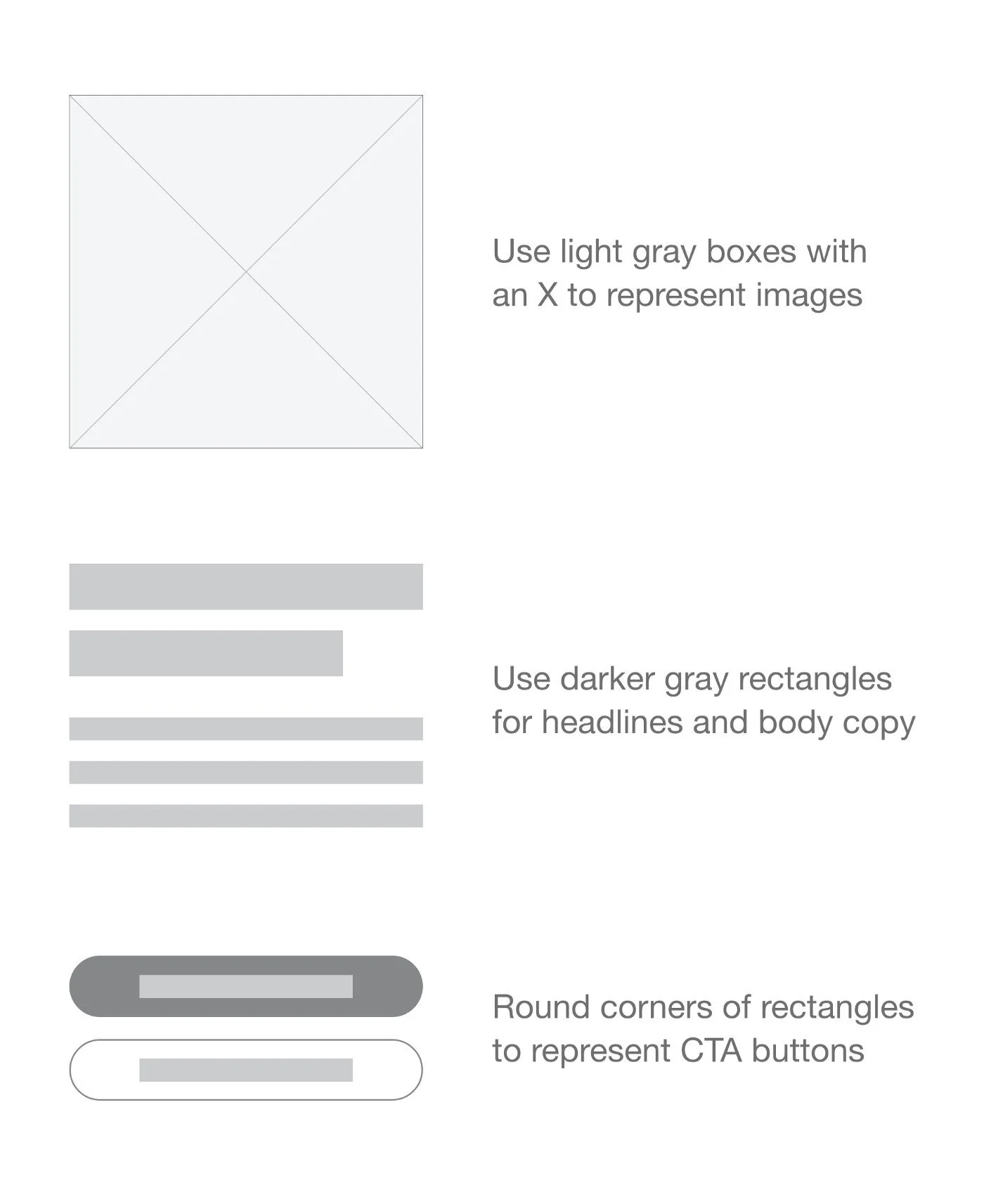
Elements of a wireframe
Use gray boxes with an X marked across to represent an image placement, rectangular boxes for headline and body typography, and various shades of gray to communicate contrast with color backgrounds. Redraw each element of the landing page with lines and shapes.

Wireframe for Twitter landing page
UX design tips from Twitter
I love how simple and effective the Twitter landing page design is. It uses a split design successfully by focusing on what Twitter is on the left and encouraging sign-ups on the right half.
Twitter’s copy is to the point which is important to emphasize as it’s a social platform allowing users to express thoughts in 280 characters or less.
Twitter leaned into a minimal design for the signup process. Rather than bombarding a new user with various fields which usually lowers conversion rates, it’s a 2 step opt-in process. Once a user clicks on Sign up, a popup module appears.

Twitter sign up popup module
Repeat the process for other landing page designs
Here’s another wireframe example inspired by the Pinterest welcome landing page design.

Wireframe for Twitter landing page
UX design tips from Pinterest
Notice subtle design decisions like the variation in the Log in button versus the Sign up button. Most websites highlight the signup button since businesses are usually more concerned with customer acquisition. But Pinterest takes an opposite approach and focuses on enhancing the experience for existing users by highlighting the Log in button.

Design variation in Log in vs Sign up
What’s successful about this design is how the landing page cycles through 4 variations. The headline changes along with the pin images. This is important to communicate the various ways users can use Pinterest. It’s not just about pinning healthy recipes, you can search for fashion inspiration, home decor, and so much more.
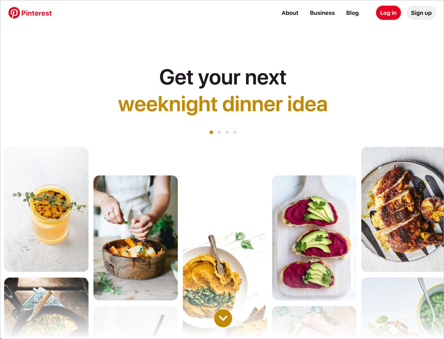


In only one of these designs was shown on the homepage, instead of all 4, you would lose other potential audiences.

Bouncing button animation prompts the user to scroll down
There’s also a bouncing button enticing the user to scroll down. An invitation to join Pinterest through a sign up form appears.
This is a thoughtful design decision on Pinterest’s part. Rather than being abrupt and asking for you to sign up immediately, they warm you up with what Pinterest is and all the inspiring possibilities.

Signup form appears after scrolling down the page
Continue to analyze commonly used websites
The next time you’re pressed for ideas at the start of a new web design project, I encourage you to analyze your most commonly used websites. What can you learn from them? What decision decisions did they make that either helped or harmed the user experience?
Dissect each element of the landing page by literally copying the elements into wireframes. By repeating this process over and over, you’ll continue to learn best practices for good UX design.